You invested real time and money into making your website look great. Clean design, strong visuals, a layout that feels polished. And yet the leads aren't coming in the way you expected.

This is one of the most common frustrations I hear from business owners and marketing teams. The site looks the part, but it isn't performing. The reason, more often than not, comes down to one thing: the user journey was never part of the plan.

After years of building custom web solutions for marketing teams, I can tell you that a good-looking website and a well-designed website are not the same thing. The ones that consistently generate leads, nurture prospects, and drive conversions are built around how people actually move through them.

A person examines a design document displayed on a computer screen, focused on the details of the project.

What Is the User Journey?

The user journey is the full path a person takes when interacting with your brand online. It starts the moment they first find you (through a search result, an ad, a referral link) and continues through every step they take until they convert or leave.

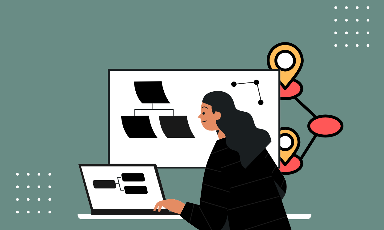
Mapping the user journey means documenting those paths for different types of visitors so you can spot where people get confused, lose interest, or hit a wall, and fix those moments before they cost you a conversion.

Here is a visual overview of the five core stages most visitors move through:

An infographic illustrating the key stages of User Journey

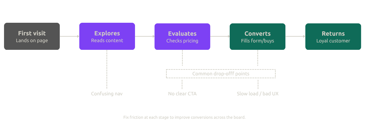
Every stage above is a place where your website either earns or loses that visitor's trust. The ones that do it well are not necessarily the prettiest. They are the clearest.

Why a Pretty Website Is Not Enough

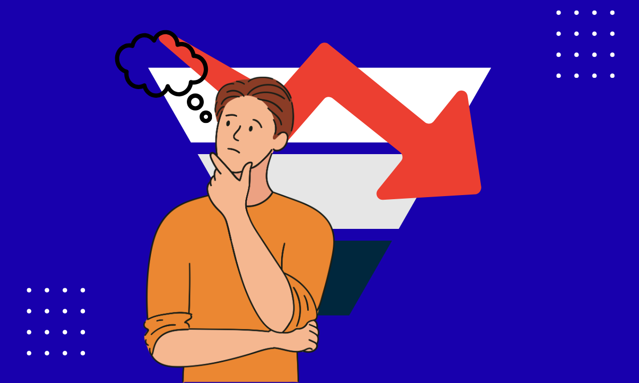
Think about the last time you landed on a visually impressive site and still left frustrated. Maybe the menu made no sense. Maybe you could not find the pricing. Maybe the contact form asked for ten fields when you just wanted to ask one question.

That experience is more common than most businesses realize, and it is quietly costing them leads every single day.

When visitors land on your site, they are not there to admire the design. They have a goal: find an answer, compare options, solve a problem. If your site gets in the way of that goal, they leave. It does not matter how good it looks.

This is why user experience (UX) design is so central to marketing success. UX is not just a visual discipline. It is the practice of understanding what your visitors need and building a website that gets them there without friction.

4 Reasons the User Journey Directly Impacts Your Marketing Results

1. It puts your audience first, not your brand

Good marketing starts with understanding what your customers actually want. A user-centered website asks the right questions before a single pixel is placed.

What problem brought them here? What are they hoping to find? What would make them feel confident enough to reach out or buy?

By mapping out the paths different segments of your audience take through your site, you can design for their needs rather than for internal preferences. That shift in perspective changes everything about how a website performs.

2. Simplicity drives conversions

People are busy. They are not going to spend five minutes trying to figure out how to contact you or what your service actually does. Every unnecessary click, every confusing menu, every buried call to action is a chance for them to give up and go elsewhere.

A well-designed user journey removes those obstacles. It makes navigation obvious, keeps calls to action visible and clear, and shortens the path from "I'm interested" to "I'm ready to act." The result is higher conversion rates without spending more on traffic.

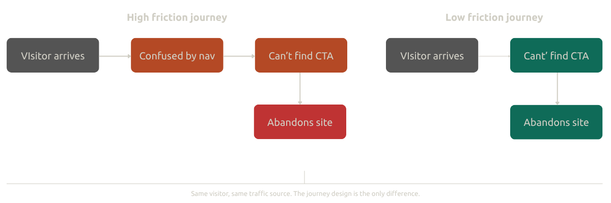
Here is what the difference looks like in practice:

Visual representation of the process stages, detailing each step and its significance in the overall workflow

3. A smooth experience builds trust

Your website is often the first real interaction someone has with your business. And just like a first meeting in person, the impression it leaves matters a lot.

A site that is hard to use signals something is off, whether that is lack of care, lack of professionalism, or just lack of attention to detail. A site that is easy to use signals the opposite. It says you respect your visitor's time, you have thought about their needs, and you run a tight ship.

That trust compounds. Visitors who feel confident in the experience are more likely to fill out a form, make a purchase, or recommend you to someone else.

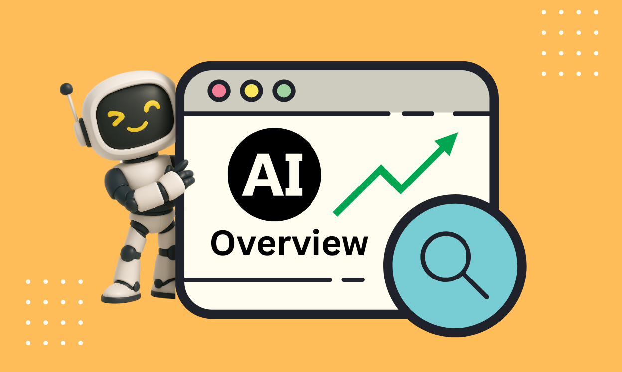
4. UX directly supports SEO and AEO performance

This one surprises people, but it should not. Search engines measure how people behave on your site, not just what your site says.

If visitors bounce quickly, Google takes note. If they spend time reading and clicking through to other pages, Google takes note of that too. Page speed, mobile responsiveness, clear structure, and low bounce rates are all UX factors that influence where you rank.

For AEO (Answer Engine Optimization), the connection is even tighter. AI-powered answer engines like Google's AI Overviews favor pages that are clearly structured and answer questions directly. If your content is organized around real user questions, with clean headings, logical flow, and easy-to-scan answers, it is far more likely to be pulled into those featured responses.

Good UX and good search performance are not separate strategies. They reinforce each other.

The Most Common User Journey Mistakes That Kill Conversions

Here are the issues I see most often when auditing websites for clients:

Buried or unclear calls to action. If a visitor has to hunt for your contact form or booking button, you have already lost most of them. CTAs need to be visible without scrolling, worded clearly, and repeated at logical moments throughout the page.

Navigation that requires guesswork. Menu labels like "Solutions" or "Our World" sound creative but they tell visitors nothing. Use plain language that matches what people are actually looking for.

Forms that ask for too much. Every extra field you add to a form reduces the chance someone completes it. Only ask for what you genuinely need at that stage of the relationship.

Pages that load too slowly. A one-second delay in load time can reduce conversions by 7%. On mobile, the impact is even worse. Speed is not a technical nicety, it is a conversion lever.

No clear value proposition above the fold. When someone lands on your homepage, they should know within five seconds what you do, who you do it for, and what they should do next. If that is not immediately clear, most people will not stick around to find out.

How to Start Improving Your User Journey Today

You do not need a full redesign to make meaningful improvements. Here is a practical place to start.

Walk your own site like a stranger would. Pick one key conversion goal (a contact form submission, a demo booking, a purchase) and navigate to it as if you had never seen your site before. Make a note of every moment of confusion or hesitation.

Ask someone else to do the same. You are too close to your own site to see it clearly. Watch a colleague or a friend try to complete a task, and do not say a word. Just observe where they pause or get lost.

Use data to find the biggest drop-offs. Google Analytics shows you where people exit. Heatmap tools like Hotjar show you where they click and scroll. Session recordings let you watch real users in action. Between these tools, the friction points become very visible very quickly.

Prioritize the highest-traffic, highest-intent pages first. You do not need to fix everything at once. Start with the pages where the most potential conversions are happening (or not happening) and work from there.

Frequently Asked Questions About the User Journey

What is the user journey in simple terms?

The user journey is the path a visitor takes through your website from the moment they arrive to the moment they convert or leave. It covers every page they view, every decision they face, and every obstacle they encounter along the way.

The Bottom Line

A website that looks great but functions poorly is not a marketing asset. It is a very expensive brochure that most people leave without reading.

The user journey is what transforms a website from something that exists into something that works. When you design around how your visitors actually think and move, everything improves: the experience, the trust, the SEO, and ultimately the conversions.

Start with one path. Walk it yourself. Fix one thing. Then keep going.


You have the traffic. Your SEO is doing its job. Your paid ads are live. But your website conversion rate tells a different story.

This is one of the most common and costly gaps in digital marketing. Businesses pour budget into driving visitors to a site that was never built to convert them. The result? A steady stream of traffic with little to show for it in leads, sales, or signups.

Here is a breakdown of the real reasons your website conversion is underperforming and what you can do about it.

Visual representation of a funnel diagram indicating reduced conversion rates

What "Website Conversion" Actually Means

Website conversion is not limited to completed purchases. Depending on your business goals, a conversion might be a contact form submission, a demo booking, a newsletter signup, a whitepaper download, or simply a click on a key call-to-action. If users are arriving on your site and leaving without taking any of those actions, you have a conversion problem worth solving.

You Designed for Aesthetics, Not Action

Beautiful sites do not automatically convert. In fact, heavy animations, oversized hero banners, and image-first layouts often work against clarity and speed, two factors that directly impact website conversion.

The fix is to lead with a clear message above the fold. What do you offer, and who is it for? Every page should have a visible, specific call-to-action that does not require scrolling to find. Design choices that prioritize visual impact over user intent quietly sabotage conversion rates every day.

Slow Load Times Are Costing You Conversions

Speed is not a technical nicety. It is a conversion lever. Research consistently shows that conversion rates decline significantly with every additional second of load time. If your site takes more than three seconds to load on mobile, you are losing visitors before they even see your offer.

Practical improvements include compressing and serving images in modern formats, deferring non-essential scripts, enabling caching, and using a content delivery network. These are not optional optimizations. They are baseline requirements for competitive website conversion performance.

UX Friction Is Quietly Driving People Away

Confusing navigation, cluttered layouts, and poorly structured forms create friction. Friction kills conversions. Users do not troubleshoot their way through a bad experience. They leave.

Improving UX for website conversion means simplifying your visual hierarchy, shortening forms especially on mobile, making calls-to-action easy to spot at every stage of the page, and removing any navigation pattern that requires a user to guess where they are or where to go next.

You Are Not Measuring the Right Behavior

Most analytics setups track pageviews and sessions. That tells you traffic, not intent. Without understanding where users drop off, what they click, or how far they scroll, you are optimizing based on incomplete data.

Tools like Hotjar or Microsoft Clarity give you behavioral insight that session counts never will. Pairing those with event tracking in GA4 for micro-conversions such as form starts, scroll depth, and button clicks gives you a real picture of where your website conversion funnel is breaking down.

Generic Templates Limit Your Conversion Potential

Out-of-the-box website templates are built for visual flexibility, not funnel strategy. When your landing pages, service pages, and campaign pages all follow the same generic structure, you end up with a site that looks polished but is not purpose-built to move visitors toward a decision.

High-performing website conversion requires pages structured around funnel stages: awareness, consideration, and action. Campaign landing pages should be distinct from your homepage. Trust signals, testimonials, and case studies need to be placed where hesitation typically occurs, not as afterthoughts at the bottom of a page.

Weak Messaging Undermines Everything Else

You can optimize load speed, clean up UX, and install every analytics tool available, but if your messaging is vague, jargon-heavy, or disconnected from what your audience actually cares about, your website conversion rate will stagnate.

Strong conversion copy leads with a specific, benefit-driven headline. It speaks directly to the problem your audience is trying to solve. It places proof points and social proof early in the page, not after paragraphs of feature descriptions. Content is not the decorative layer on top of your website strategy. It is the strategy.

The Marketing Strategist's Bottom Line

Website conversion is not a single fix. It is the outcome of how your site loads, how it communicates, how it guides behavior, and how well you measure and iterate on all of it.

If your site is generating traffic but not generating pipeline, the problem is not your audience. The problem is the system you are sending them into. Audit your speed, tighten your messaging, build pages around intent, and track behavior at every stage. That is where conversion improvement actually lives.


If you have searched on Google recently, you have probably noticed something different at the top of the page. Before any traditional blue links appear, there is now a box labeled "AI Overview" that hands you a ready-made answer. That is not a coincidence or a beta test anymore. It is Google's new normal, and if your business depends on organic traffic, it changes everything about how you need to think about content.

Overview of artificial intelligence concepts and applications, featuring diagrams and key terms related to AI technology.

What Exactly Is AI Overview?

AI Overview is a feature built directly into Google Search that generates a concise, AI-powered summary in response to a query. It sits at the very top of the search results page, above every traditional organic listing. Instead of presenting users with a ranked list of links and letting them decide where to click, Google now synthesizes an answer on the spot, pulling from multiple sources across its index.

The engine behind it is Google's Gemini, a large language model capable of understanding the intent behind a search, not just the words. AI Overview was previously called Search Generative Experience (SGE) when it was in experimental mode. Today it is widely deployed, and for many query types, it is the first thing users see and engage with.

Think of it this way: Google is no longer just a librarian pointing you toward the right shelf. With AI Overview, it is reading the books for you and summarizing what they say.

Is AI Overview Actually Useful for Searchers?

For users, the appeal is obvious. Most people searching for information want a fast, direct answer. AI Overview delivers exactly that for a wide range of informational queries. Someone asking how a medical term works, what a historical event means, or how to troubleshoot a common tech issue can get a usable answer in seconds without opening a single website.

There are real benefits here. AI Overview pulls from multiple reputable sources and synthesizes them into one coherent response, which is something a traditional SERP has never been able to do on its own. The experience feels more like talking to a knowledgeable colleague than running a keyword search.

That said, it is not a perfect replacement for traditional search results. For transactional searches like "buy standing desk" or "book a flight to Miami," users still need to visit a website. For research-heavy topics, many users still want to read the original sources, verify claims, and explore perspectives that a summary might miss. And like all generative AI, AI Overview is not immune to errors. Occasional inaccuracies, sometimes called hallucinations, do surface, though Google continues to refine the system.

The honest takeaway for a marketer is this: AI Overview is excellent at answering questions quickly, and that is precisely why it is so disruptive to traffic patterns.

Screenshot of the Google search page displaying the search bar and various search results.

The Real Impact on Organic Search Traffic

Here is where it gets important for anyone running a content-driven website or managing an SEO strategy.

When a user gets a complete answer directly on the SERP, they have no reason to click through to your site. This is the "zero-click search" problem, and AI Overview has made it significantly worse for informational content. Studies tracking post-AI Overview traffic have shown measurable declines in click-through rates, particularly for non-branded, informational queries where Google can synthesize a complete answer without requiring additional context.

For businesses that built their organic presence around top-of-funnel, educational content, this is a real shift in the economics of search.

However, there is an important flip side. Users who do click through from an AI Overview tend to be further along in their thinking. They have already read the summary and decided they want more. That makes them more engaged, more likely to trust your content, and often closer to taking action. So while raw traffic volume may decrease, the quality of what comes through can actually improve.

The challenge now is twofold: minimize the traffic loss where possible, and position your brand to be cited as a source within AI Overview itself.

How to Win in an AI Overview World

Getting your content featured inside an AI Overview summary is quickly becoming one of the most valuable positions in search. It is the new first-page ranking, except instead of a blue link, it is your information being presented as the answer. Here is how to think about it from a content and SEO strategy perspective.

Answer questions directly and completely. AI Overview draws from content that does the work of answering a specific question clearly and without ambiguity. If your articles bury the lead, AI has nothing useful to extract. Structure your content so the answer appears early, and then support it with depth.

Build topical authority. Google's AI is more likely to cite sources it recognizes as authoritative on a topic. This means consistently publishing well-researched, accurate content within a defined subject area rather than spreading thin across many unrelated topics. The E-E-A-T framework (Experience, Expertise, Authoritativeness, Trustworthiness) is no longer just a guideline. In the age of AI Overview, it is the selection criteria.

Use structured data and clean formatting. Clear headings, schema markup, and logically organized content make it easier for Google's AI to extract and summarize your information. Unstructured walls of text are harder to parse and less likely to be cited.

Think in questions, not just keywords. Your audience is searching conversationally. Content that anticipates follow-up questions and provides layered answers performs better in this environment because AI Overview tends to reward depth alongside clarity.

Do not abandon informational content. Yes, zero-click searches are increasing. But being cited in an AI Overview still puts your brand in front of the user, builds recognition, and often drives branded searches later. Visibility at the answer layer still matters even when no click happens immediately.

What This Means for Your Long-Term Strategy

AI Overview is not a trend you can wait out. Google has confirmed it is subject to core algorithm updates, meaning it will only become more sophisticated and more central to how results are delivered over time. The brands and publishers who adapt their content strategies now will be far better positioned to maintain visibility than those who treat this as a temporary disruption.

The goal is no longer just ranking for a keyword. The goal is becoming the source that Google's AI trusts enough to cite when a user asks a question that matters to your business. That requires better content, clearer expertise, and a deeper understanding of what your audience actually wants to know.

The search landscape has shifted. AI Overview is not coming. It is already here, already influencing how millions of people access information every day. The question is whether your content is built to show up in it.

Frequently Asked Questions

What is AI Overview?

AI Overview is a Google Search feature that generates an AI-powered answer at the top of search results, synthesizing information from multiple sources using Google's Gemini language model. It was previously called Search Generative Experience (SGE).


In this tutorial, I'll show you how to capture the original referral source of your website visitors and store this information in a hidden field on form submissions using a simple WordPress plugin.

Plugin Overview

The plugin works by:

  • Tracking the referral source when a user visits the site.
  • Storing the referral source in the user's session.
  • Dynamically populating this referral source into hidden form fields on supported form builders like Gravity Forms and WPForms.

Getting Started: Setting Up the Referral Source Tracker Plugin

Step 1: Plugin PHP Code

Here’s the full PHP code for the plugin, which we'll go through step by step:

Step 2: Understanding the PHP Code

1. Tracking the Referral Source:

  • The plugin hooks into the WordPress wp action, which runs after WordPress has loaded. It checks if a referral source is already stored in the user's session. If not, it extracts the HTTP_REFERER to determine where the user came from (Google, Bing, Facebook, etc.).
  • Depending on the source, the referral information is stored in a session variable ($_SESSION['referral_source']).

2. Retrieving the Referral Source:

  • The get_referral_source() function retrieves the referral source from the session. If it's not set, it defaults to "Direct or Other."

3. Populating the Referral Source in Forms:

  • The plugin supports Gravity Forms and WPForms. The referral source is dynamically added as a hidden field using the gform_field_value_referral_source and wpforms_field_value_referral_source filters.

4. Enqueueing JavaScript:

  • A JavaScript file (referral-source.js) is enqueued to pass the referral source to the front-end forms.

Step 3: JavaScript to Handle the Hidden Field

Now let’s write the referral-source.js file that will handle inserting the referral source into a hidden field.

Step 4: Adding the Hidden Field to Your Form

If you're using Gravity Forms or WPForms, you’ll need to add a hidden field to your form where the referral source will be stored. Here’s how:

  • Gravity Forms: Add a hidden field and set its default value to {referral_source}. This will automatically pull in the referral source tracked by the plugin.
  • WPForms: Add a hidden field and use the referral_source as the dynamic population value.

Step 5: Testing the Plugin

  1. Install the plugin by adding the PHP code to a new file in the /wp-content/plugins/ directory of your WordPress installation.
  2. Create a Gravity Form or WPForm with a hidden field for "Referral Source."
  3. Visit your website through different channels (e.g., Google, Facebook) and submit the form.
  4. Check the form entries to ensure that the correct referral source is captured.

With this custom plugin, you can track where your leads are coming from and automatically store that information in your form submissions. This is especially useful for optimizing marketing efforts and understanding which platforms are driving the most traffic to your website.

Feel free to download the plugin code from my GitHub repository and use it in your projects. You can find the code here.


The modern SaaS buyer does not move in a straight line. They search, compare, abandon, return, and reconsider before they ever enter a credit card number. Customer journey mapping is how growth-focused teams stop guessing and start seeing every step of that path.

A woman focused on a laptop displaying a map, engaged in work or planning activities.

What Is Customer Journey Mapping?

Customer journey mapping is the process of documenting every interaction a prospect or customer has with your brand, from the moment they first discover your product to long after they become a paying user. It gives your team a strategic blueprint of the world through your customer's eyes, not your internal org chart.

For SaaS companies, that journey rarely has a clean beginning or end. A potential user might find your blog through organic search, compare your product on G2 weeks later, start a free trial after seeing a retargeting ad, go dark for a month, and then convert after a single follow-up email. Customer journey mapping captures that entire arc, with all its detours.

The output is usually a visual artifact, such as a swimlane diagram or a layered board, that shows each lifecycle stage alongside the touchpoints, channels, user emotions, and friction points that define the experience at that step.

The Six Stages of a SaaS Customer Journey

While no two journey maps look identical, most SaaS products share a core lifecycle structure. Understanding these stages is where effective mapping begins.

Awareness is where users first encounter your brand, whether through organic search, social media, peer recommendations, or paid ads. Consideration is the evaluation phase where they are comparing your product against alternatives, reading reviews, and assessing fit. Decision is the moment they commit, through a free trial, a demo request, or a direct purchase.

From there, the journey is just as important. Onboarding shapes whether new users actually reach their first "aha moment" or quietly fade away. Retention is the ongoing work of keeping users engaged, supported, and renewing. And Advocacy is the stage where satisfied customers refer peers, write reviews, and become your most credible growth channel.

Each stage carries its own set of touchpoints, emotional states, and dropout risks. Mapping them together, rather than optimizing each in a silo, is what separates reactive marketing from genuinely strategic growth.

Key Components Every Customer Journey Map Needs

Buyer personas anchor your map in reality. Build them from CRM data, onboarding surveys, customer interviews, and behavioral analytics, not assumptions. Without an accurate persona, you're mapping a hypothetical experience that may not reflect anyone's actual path.

Touchpoints and channels are every moment your brand and your prospect intersect. This includes paid ads, blog posts, review sites, email sequences, in-app messages, support tickets, and even invoices. Documenting touchpoints by stage reveals coverage gaps and areas of overcrowding.

Emotions and friction points are where most journey maps get shallow. Beyond logging what happens, you need to capture how the user feels at each step. Are they confident or confused when they land on your pricing page? Excited or overwhelmed during onboarding? Emotional signals are your earliest warning system for churn and your clearest guide for where to invest in experience improvements.

User goals at each stage keep the exercise genuinely customer-centric. What the user needs during awareness is fundamentally different from what they need at renewal. Mapping both perspectives, yours and theirs, prevents you from building campaigns that serve your pipeline while ignoring the user's actual intent.

Why Customer Journey Mapping Is a Growth Lever for SaaS

Knowing exactly where prospects hesitate or disengage lets you fix those moments with precision, whether that means rewriting a pricing page, adding a comparison guide, or tightening your trial-to-paid flow. The result is measurably better conversion rates.

Most SaaS churn traces back to a poor onboarding experience or expectations set during the sales process that the product never delivered on. Journey mapping surfaces those misalignments before they cost you a renewal.

When you know which stage a user is in, your marketing, product, and customer success teams can deliver the right message at the right moment. That relevance drives real engagement, not just open rates.

A journey map also works as a shared language across departments. It eliminates the "we thought they wanted X" miscommunications that quietly erode user experience over time. And when every team understands the customer's journey, prioritization gets sharper. Every campaign, every feature, every support resource can be evaluated against one shared question: does this improve the journey?

How to Build a Customer Journey Map That Actually Gets Used

The graveyard of marketing strategy is full of beautifully designed journey maps that lived in a Confluence page no one opened after Q1. Here is how to build one that drives real decisions.

Start by grounding it in real data. Pull from your CRM, product analytics, NPS results, support tickets, and direct customer interviews. The goal is to document the journey customers are actually taking, not the one you designed.

Define one primary persona per map. Trying to serve every segment in a single map produces something useless for everyone. Start with your most common or highest-value customer type, then build additional maps for other segments later.

Identify every touchpoint, including the ones you do not own. Your users read Reddit threads, check LinkedIn for social proof, and ask peers in Slack communities. Those third-party touchpoints belong in your map too.

Add the emotional layer. For each touchpoint, document what the user is thinking, feeling, and trying to accomplish. This layer is what separates a useful journey map from a glorified funnel diagram.

Assign ownership and action items. For every pain point or gap you identify, assign a team, a timeline, and a measurable outcome. That is what transforms mapping from insight into execution.

Finally, treat it as a living document. Update your map when you launch new features, enter new markets, or see a meaningful shift in behavior. A journey map from two years ago is often more misleading than having no map at all.

Customer Journey Mapping vs. Sales Funnel: The Critical Difference

These two frameworks are frequently used interchangeably, but they serve different purposes. A sales funnel is built around your company's perspective. It tracks leads moving toward a closed deal, optimized for your conversion volume.

Customer journey mapping is built around the user's perspective. It surfaces what the user is experiencing, thinking, and feeling at every stage, including the messy, non-linear parts that a funnel diagram will never show. For SaaS companies competing on experience and retention, the journey map is the more strategically important of the two. Use both, but never confuse them.

Common Questions About Customer Journey Mapping

How is customer journey mapping different from a sales funnel?

A sales funnel shows your internal conversion process. A customer journey map shows the full experience from the user's point of view, including emotions, third-party touchpoints, and post-purchase stages that funnels typically ignore.


If your website is getting traffic but your pipeline still feels empty, the problem likely is not your offer. It is the gap between a visitor's interest and your ability to respond fast enough to capture it. That is exactly where chatbots have become one of the most powerful tools in a marketer's arsenal.

Lead generation has changed. Buyers want answers now, not tomorrow. They want conversations, not forms. And they definitely do not want to wait 48 hours for a sales rep to follow up. Chatbots close that gap, and the businesses using them intelligently are pulling ahead.

Here is what a well-built chatbot strategy actually does for your lead generation efforts.

Infographic illustrating steps to enhance customer service using chatbots effectively.

Your Best Sales Rep Never Clocks Out

One of the most immediate wins chatbots bring to lead generation is availability. While your team sleeps, your chatbot is actively welcoming visitors, answering questions, and collecting contact information.

Think about the international traffic hitting your site at 2 a.m. That startup founder in London researching your SaaS product has questions. A static contact form is not going to win that lead. A chatbot that engages, qualifies, and books a discovery call will.

Lead generation does not run on business hours anymore. Your strategy should not either.

Chatbots Qualify Leads So Your Sales Team Does Not Have to Guess

Not all leads are created equal, and nothing drains a sales team faster than chasing cold prospects who were never a real fit. Chatbots solve this by acting as a first-line qualifier, asking the right questions before a lead ever reaches your CRM.

Smart chatbot flows can ask things like:

  • What is your biggest challenge right now?
  • What does your timeline look like?
  • What is your approximate budget range?

Based on those answers, your chatbot can segment leads into categories and route the highest-intent prospects directly to your team, while nurturing the rest through automated follow-up sequences.

The result is a cleaner pipeline, shorter sales cycles, and reps who spend their time closing deals rather than sorting through unqualified inquiries.

Personalization That Scales Without Adding Headcount

Traditional lead generation often forces a trade-off: you can be personalized or you can scale, but rarely both at the same time. Chatbots break that trade-off.

A well-configured chatbot can recognize where a visitor came from, whether that is a specific paid ad, an email campaign, or an organic search landing page, and immediately tailor the conversation to match that context. Someone clicking through a retargeting ad for your enterprise pricing page should not receive the same opening message as a first-time visitor from a blog post.

This kind of contextual, personalized engagement at scale is what separates modern lead generation strategies from the ones that stopped working three years ago.

Every Chatbot Conversation Is Market Research

Here is something most marketers underestimate: chatbots generate a continuous stream of intent data. Every conversation reveals what your visitors are actually asking about, where they hesitate, what objections come up most often, and which pages drive the most engagement.

That data is gold. Use it to refine your messaging, improve your landing pages, build more targeted ad audiences, and develop content that directly addresses what your prospects care about most.

Lead generation improves when you deeply understand your audience. Chatbots give you that understanding at a scale no survey or focus group can match.

The Cost Argument Is Hard to Ignore

Building and maintaining a round-the-clock sales support team is expensive. Chatbots automate the repetitive, high-volume parts of your lead generation process, from answering FAQs to booking calls to following up with prospects who visited a pricing page but did not convert.

Businesses that have integrated chatbots into their lead generation workflows report meaningful reductions in support and sales overhead costs. That savings can be redirected toward paid acquisition, content, or the strategic initiatives that actually require human thinking.

Chatbots Work Better When They Are Connected to Everything

A chatbot operating in isolation is a missed opportunity. The real power of chatbots in lead generation comes when they are connected to your full tech stack: your CRM, your email marketing platform, your scheduling tools, and your analytics dashboards.

When a chatbot qualifies a lead and books a call, that contact should flow automatically into your CRM with full conversation context attached. When a lead drops off mid-conversation, your marketing automation should trigger a re-engagement sequence. Everything connected, nothing falling through the cracks.

That level of integration turns chatbots from a simple tool into a full lead generation system.

The Strategic Takeaway

Chatbots are not a novelty feature to add to your website and forget about. When implemented with strategy and intention, they become one of your most productive lead generation assets, working around the clock, qualifying prospects, personalizing experiences, and feeding your sales team a pipeline of real opportunities.

If your current lead generation strategy relies on static forms and slow follow-ups, you are leaving revenue on the table. Chatbots are not the future of lead generation. For the businesses taking them seriously right now, they are the present.